App card
Overview
App cards are customizable cards that enable you to visualize and manage information from third-party tools directly on a Miro board, and to seamlessly send information from a Miro board to a third-party tool.
App cards provide easy access to up-to-date, structured information on your Miro boards, without having to open multiple tools, or switch among various tools repeatedly. These third-party tools include, but are not limited to, productivity, task management, project management, portfolio management, and program management tools.

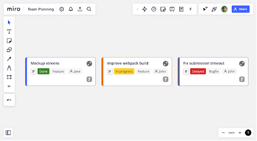
Figure 1. Miro board containing app cards (preview).
App cards have two views: the preview and the detailed view. We’ve described each view and the app card features you can use in each view.
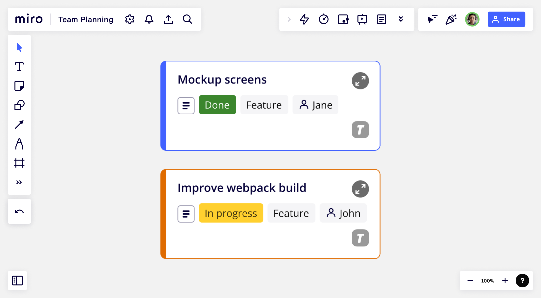
App card preview: The app card preview gives a quick understanding of core information inside the app card, without having to open the detailed view.

Figure 2. App card preview sample (enlarged for readability).
Here are the features that come with the app card preview:
-
Custom fields: these fields are displayed on the preview of cards and app cards.
You can define up to 20 custom fields for a card or an app card.- These fields can be a subset of the fields available in the detailed view of the card or app card.
- Information in custom fields cannot be edited via the Miro board UI.
- Information in custom fields can only be updated either on the third-party tool or via the detailed view of the card or app card (if implemented).
-
UI customization:
- You can define the app card theme, icon, icon shape, text color, fill color, and for an app card preview.
- The app card preview displays the custom fields, the app card icon on the bottom right, and the status icon appears when hovering the mouse over the top-right corner of the app card.
- To provide a great experience for your users and meet app review requirements, we recommend using UI components from our interface library, Mirotone. We have an App card CSS component that you can use to represent Miro app cards in your interface. Additionally, we also have a Mirotone component library for Figma with an App card that you can use in your designs.
-
Data sync: The fields in the app card preview need to be synced to reflect the updates made by a user on the third-party tool or on the app card detailed view.
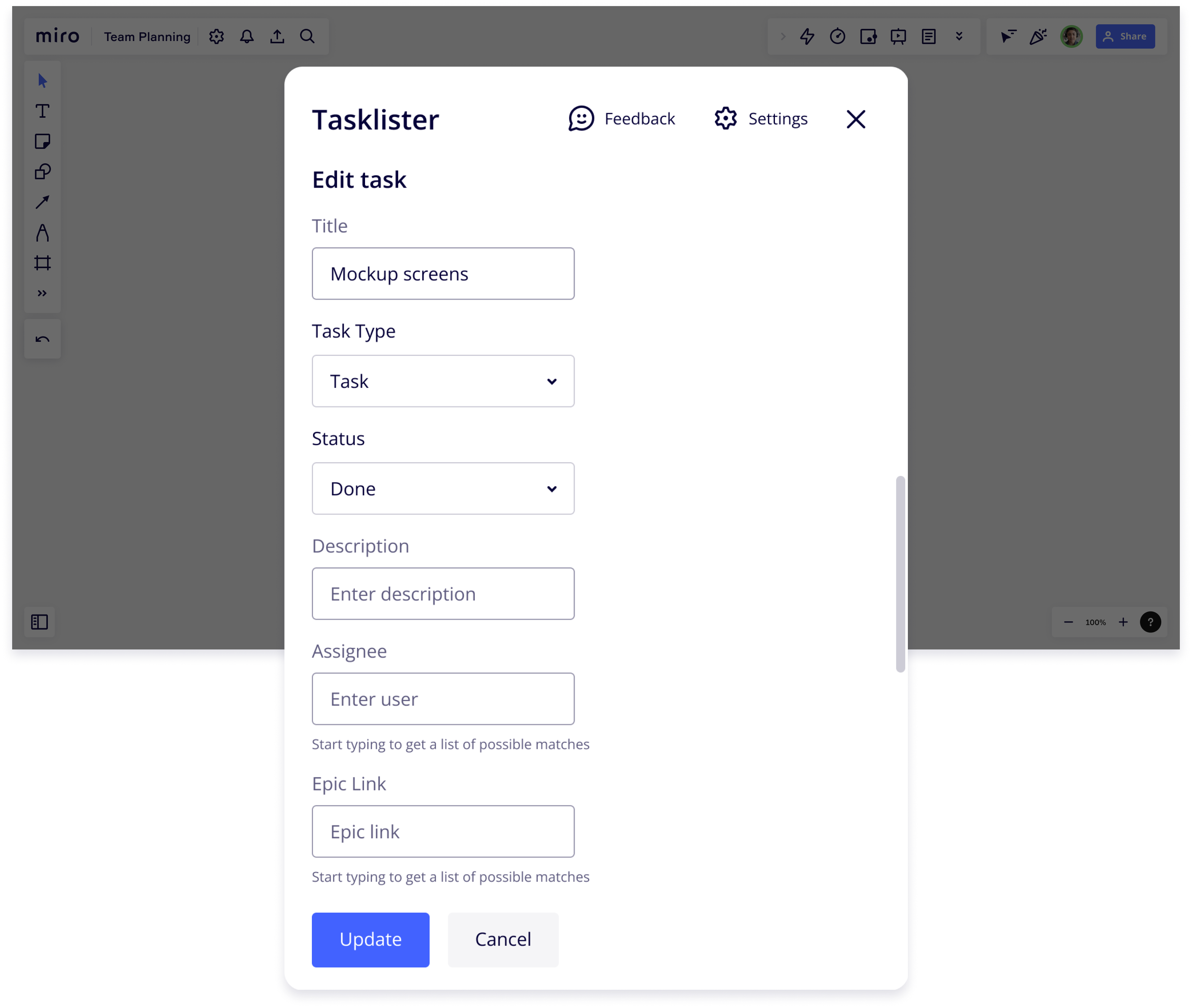
App card detailed view: This is the view the user sees when the user clicks on the open modal icon on the app card preview.
For more information, see the app_card:open event.
We understand that different apps or tools have different data representations and fields supported while defining a task or a project. To allow your app the flexibility of being able to easily bring this information to Miro users, we allow you to load an iFrame within the app card detailed view.

Figure 3. App card detailed view sample (enlarged for readability).
Here are the features that come with the app card detailed view:
-
Custom fields: Via an iFrame on your app, you can implement the UI and logic to display the detail view of an app card where you control what information you want to display to the user when they expand an app card. You can also allow users to view and edit any app card content or fields that correspond to information in a third-party tool.
-
UI customization: While you have full freedom to define the representation of fields within the detailed view, to provide a great experience for your users and meet app review requirements, we recommend using UI components from our interface library, Mirotone. We have an App card CSS component that you can use to represent Miro app cards in your interface. Additionally, we also have a Mirotone component library for Figma with an App card that you can use in your designs.
-
Data sync: It is implicitly understood that as the app card detailed view is an iFrame that you’ve implemented and hosted, you’ve also implemented the data sync logic with a third-party tool.
If the fields in the app card preview are a subset of the fields in the iFrame in the app card detailed view, you need to implement the logic to sync the changes made by the user on the detailed view so that the changes are reflected on the app card preview.
Card versus app card usage
Both cards and app cards are feature-packed item types. The decision on whether to use a card item or an app card item mainly depends on your use case and customization needs.

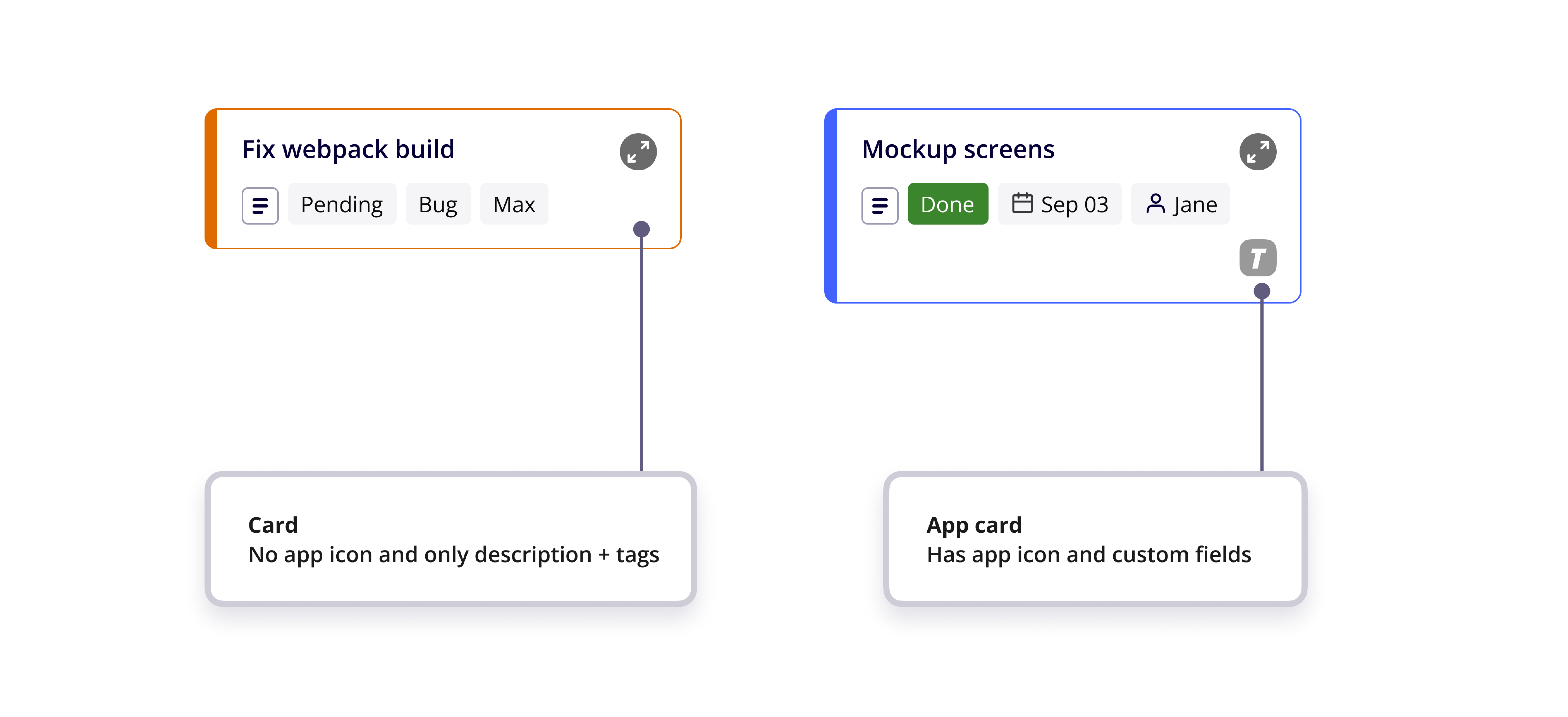
Figure 4. Example of a card item on the left and an app card item on the right.
We recommend cards for use cases where you want to transform the data and represent it in the form of cards on a Miro board, with little or no need to further process or customize the data.
Cards have a fixed set of fields: the card title, description, assignee, and a due date.
Cards can also include up to 20 custom fields.
We recommend app cards to implement integrations with third-party tools to bring data as is and sync information updates.
With app cards, you can create and add up to 20 custom fields. We recommend limiting custom fields to a maximum of 8.
The usage of app cards is mainly applicable for productivity, project management, program management tools where you have information that you’d like to display on a Miro board and in turn sync updates from a Miro board to the third-party tool.
Via an iframe on your app, you can implement the UI and logic to display the detail view of an app card where you control what information you want to display to the user when they expand an app card. Using the app card detail view, you can also allow users to view and edit any app card content or fields that correspond to information in a third-party tool.
Let’s consider two simple use cases where you have a 3-day workshop booked in a Google Calendar and the requirements are different for each of these use cases.
Use case 1: You want to simply transform the data in the Google calendar invite for each day and represent these calendar invites as items in a Miro board that maps the calendar date with the item due date, the title of the calendar invite as the item title, and the agenda as the description.
Recommended item type: Card. This is because the card item meets all your requirements in this use case. You do not need to display any additional information in the detail view in this use case. Using a card item type addresses your requirements.
If your use cases requires data sync, you can also implement the integration logic for data sync between the Google Calendar and the card item on the Miro board.
Use case 2: You want to import the data in the Google calendar invite for each day and represent these calendar invites as items in a Miro board that maps each field in the calendar invite with a custom field in the item on the Miro board. Additionally, in the detail view, you want to display Google Maps to provide location information and assistance for your workshop venue.
Recommended item type: App Card. This is because your use case needs custom fields, as well as a detail view custom logic that you’ve implemented in your app for the Google Maps location assistance. If your use cases requires data sync, you can also implement the integration logic for data sync between the Google Calendar and the app card item on the Miro board.
Feature comparison between app cards and cards
| Feature | Card | App Card |
| Customization of data
(Adding/removing custom fields) |
✅ | ✅ |
| Sync with third-party tool | ✅ | ✅ |
| Preview | ✅ Information in the card preview can be edited via the UI. |
✅ Information in the app card preview cannot be edited via the UI. |
| Detail view |
|
|
| Data model differences | By default, cards have the following properties that app cards do not have:
|
By default, app cards have the following properties that cards do not have by default:
For more information on the properties of an app card, see the Web SDK reference or the REST API reference. |
| Tags | ✅ | ❌ |
| UI: Custom icon | ❌ | ✅ |
| UI: Style: Set custom border color |
✅ | ✅ |
App card use cases
See the documentation on app card use cases.
App card design
To provide a great experience for your users and meet app review requirements, we recommend using UI components from our interface library, Mirotone.
We have an App card CSS component that you can use to represent Miro app cards in your interface. Additionally, we also have a Mirotone component library for Figma with an App card that you can use in your designs.
See also
- App card Web SDK reference
- App card REST API reference
- App card use cases
- Edit, update, and keep app cards synced
- Enable REST API authentication from Miro's Web SDK authorization
- Backend flow for app cards
- Enable 2-way sync between app cards and GitHub cards
- Mirotone app card CSS component
- Mirotone component library for Figma